

Process
Information Architecture
Goal Setting
Heuristic Evaluation
Task Based Evaluation
Comparative Analysis
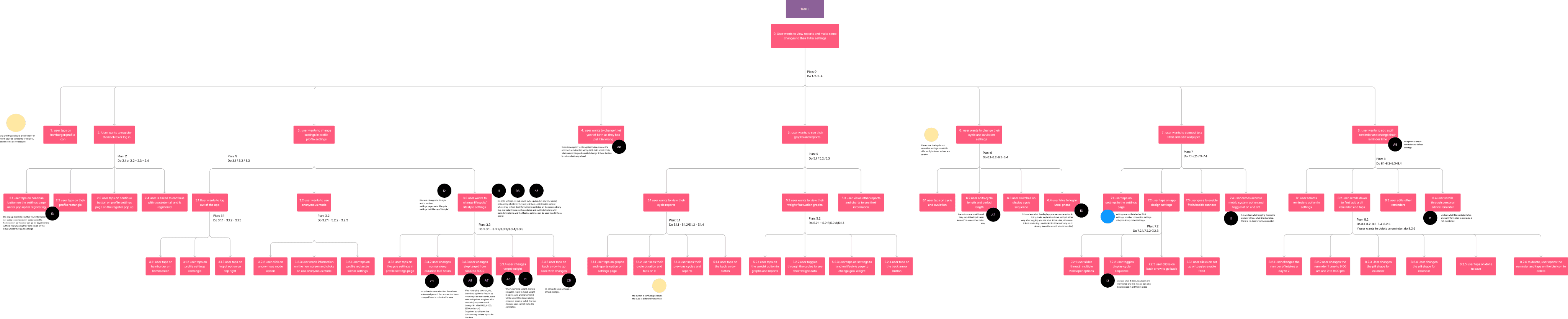
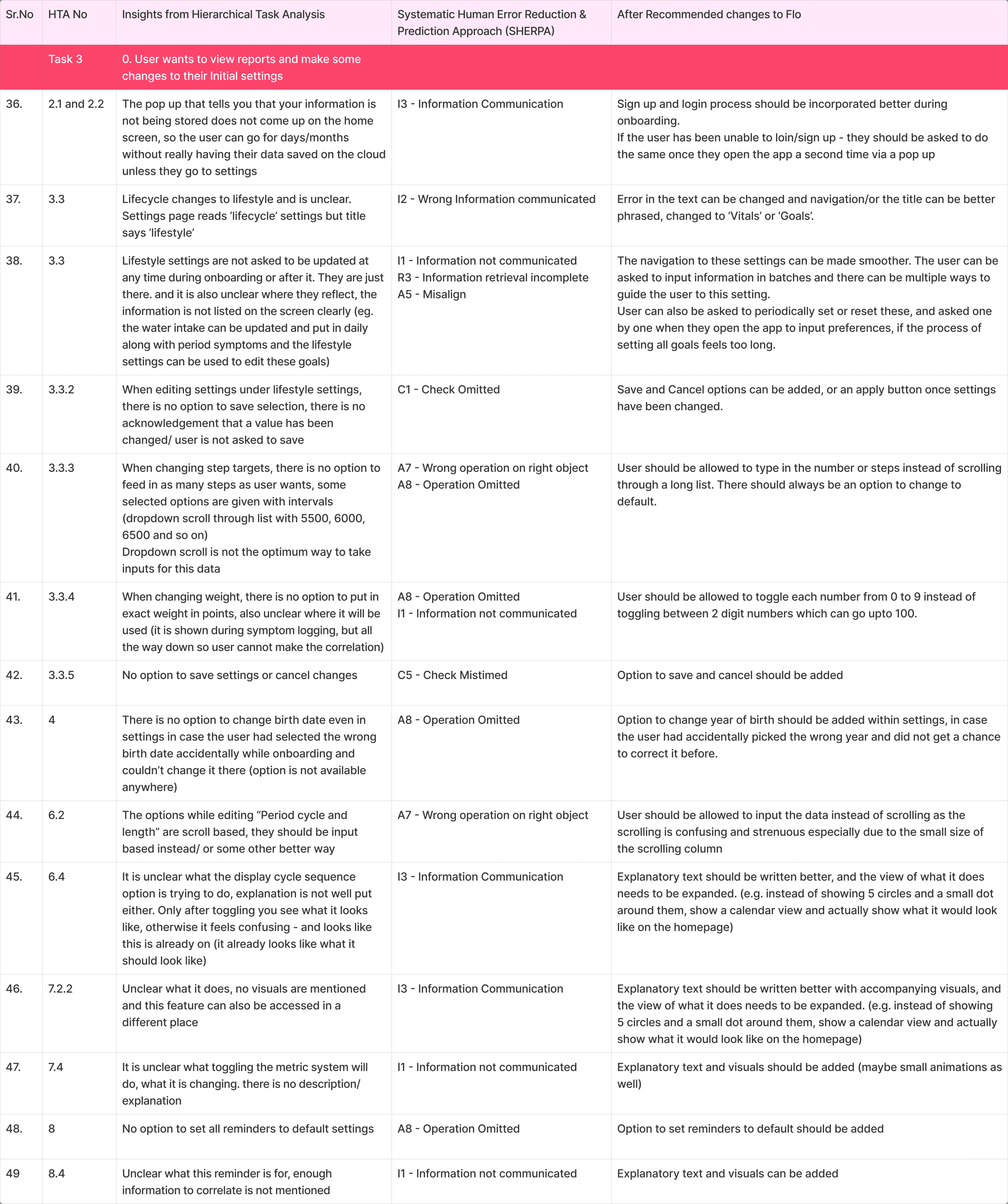
HTA and Sherpa
Revised Designs

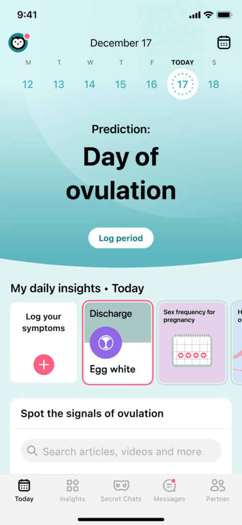
The Flo app is a period tracker and women's health app that helps users track their menstrual cycle, ovulation, and general health. Evaluating its design is important to ensure a user-friendly interface, accessibility, and a seamless experience, which ultimately contributes to better user engagement and satisfaction.
What ?


Primary Goals
Track and Calculate
Pregnancy
Ovulation
Fertility
Due Date
Goal Setting
Ease of Use
Learnability
Subjective Satisfaction
Error free Use
Ease of Communication
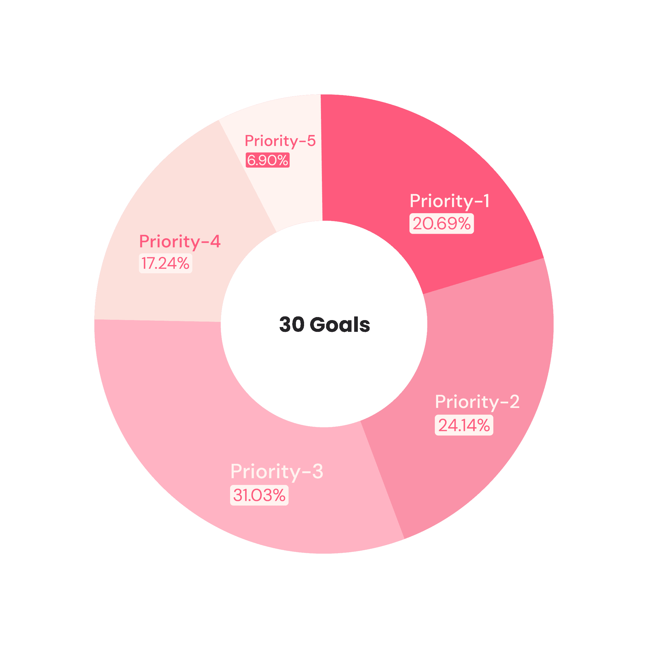
User should be able to easily track the dates of Period and Ovulation - 5
User should be able to easily log their Symptoms, feelings and details - 4
Users should be able to fill in details easily and intuitively without requiring much guidance - 2
Users should be able to ask queries easily - 1
Product should provide auto fill suggestions for some details and goals - 1
User Experience Goals
Speed of Use
User should be able to log details fast - 3
Product should be able to give out important information without making the user feel cognitive load - 2
User should be able to fill information in the sequence most convenient to them - 3
User should be able to get answers for queries in urgent situations - 3
User should be able to manage their preferences and customise the symptoms and options to their use - 1
It should be easy for users to look through insights - 2
Users should be able to find reports easily - 2
Users should take very little time to learn to log in dates & symptoms - 3
Product icons, interactions, visuals etc should be consistent - 3
Users should be able to see cycle details and their history easily - 4
Users should be able to find settings and features easily - 3
It should be easy to edit previously logged period dates and keep log of body changes and cycle until next period for the user - 4
User should be able to edit and add symptoms - 3
Chatbots should give error free personalized insights - 1
User should be given feedback and asked to confirm when saving information - 1
User should be notified about the important dates and days timely - 4
User should be able to understand the terms and options given - 2
User should be able to relate the graphics and text to real life - 3
Users should get information about how and why their body behaves throughout cycle - 5
User should be able to learn about insights of each day of the cycle - 4
Understanding cycle, mood or body predictions and other information should be easy and intuitive for the user - 1
User should be able to have a Stigma free space to discuss female body issues that are otherwise considered taboo - 3
User should be able to involve and educate partners about the body - 2
Users should be able to personalize the additional content - 2
Users should find the app pleasing to view - 4


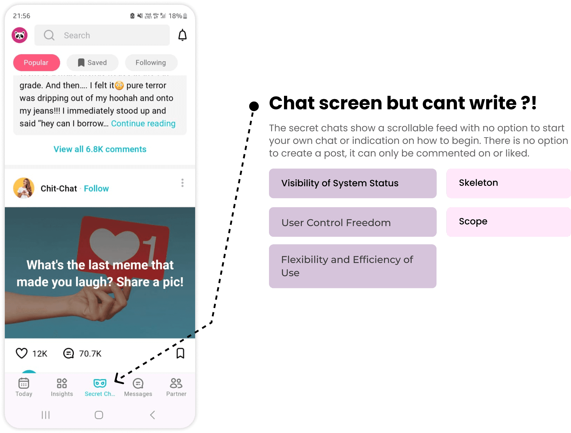


Heuristic Evaluation


Clue scores better aesthetically because it seems to be less cumbersome at first glance
Clue gives the user customizability options even though when the number of options is compared, there are fewer in clue than in Flo. The absence of customizability is something the app must address.
Both apps are fairly accurate, however they fail when it comes to irregular predictions
Flo’s information design is done well, however due to the body of content available being so large - it can get confusing and feel like there is a lot of information overload
Flo tries to reduce cognitive load by predicting cycles and symptoms, whereas clue only tries to predict PMS. Overall, apart from this, there are fewer details in Clue which is a pro and a con.
Flo provides the user will more graphs and charts but clue does not provide that feature
The amount of information available on Flo as well as the support is better than what clue offers
Both apps have similar cycle views
V/S
Insights
Comparative Analysis
Onboarding
Open the App & Follow Instructions
Answer the questions and read through the screens
Input 3rd October as the first day of your last period
1
2
3
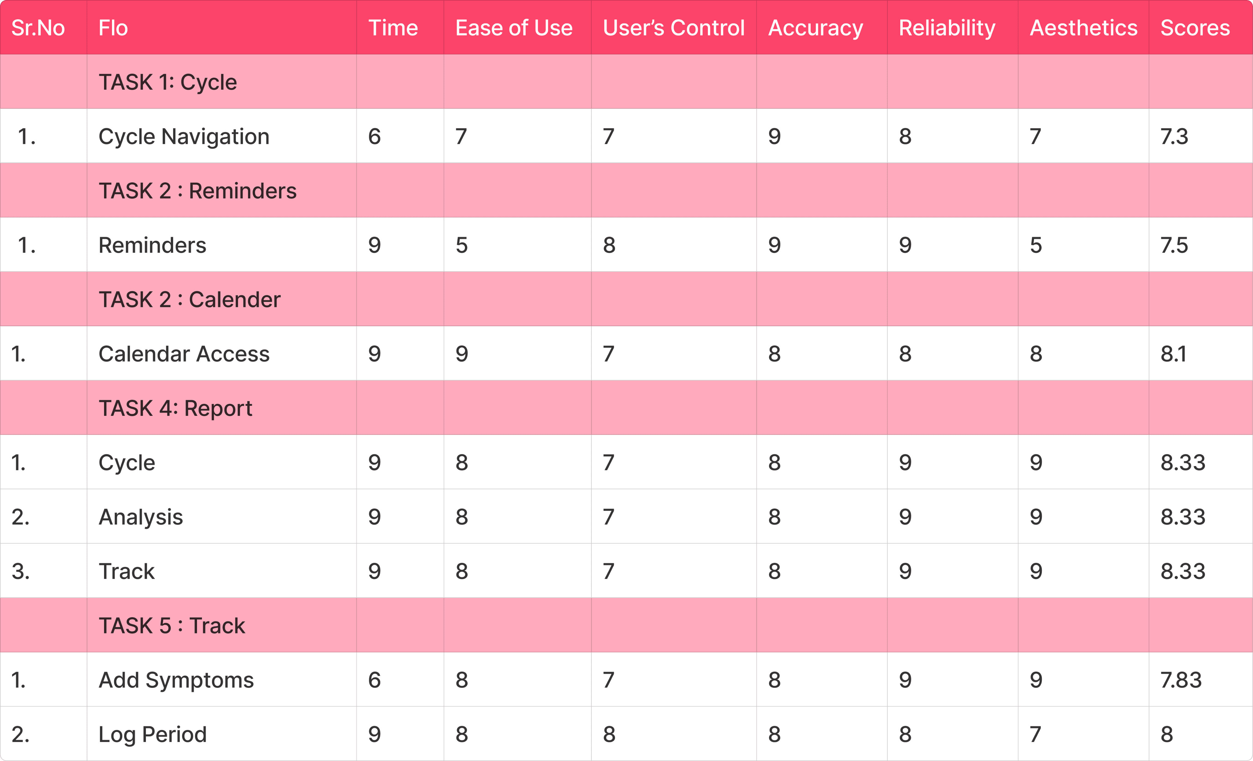
Task Based Evaluation
Logging period & symptoms
Log in your period and select today and yesterday as period days
Log in your symptoms and input 2 feelings
After choosing feelings, Log in any 5 symptoms from categories below
1
2
3
Change the reminder time
Go to Reminders
Select ‘period in a couple of days’ reminder
Change the time to 6:00 pm
1
2
3
Go back to Homescreen
4
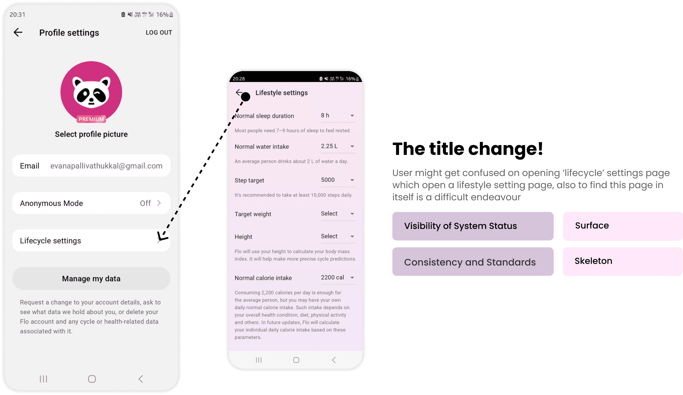
Edit lifecycle settings
Go to lifecycle settings
Change your normal sleep duration to 6h
Go back to homescreen
1
2
3
Participants
Females
10
19-24 Years

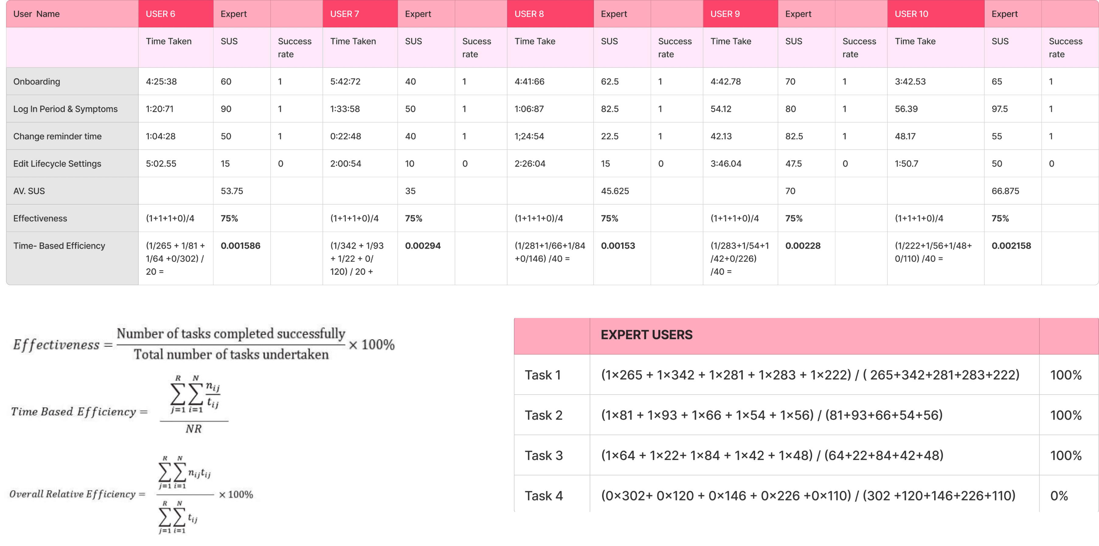

Experts took lesser time (average of 1 min) than the novice to finish onboarding (Task 1). Everyone completed the task. It was easier for experts to complete as they were used to the terms and questions asked while novices took time to understand
All users (experts & novice ) completed the Task 2. The experts knew the fastest method to log details while novices took the longer route
All users except 1 novice completed Task 3. Some experts also found it difficult to find reminders since it was a hidden option
Mean SUS Score: 58
for Novice Users reflects low usability
Mean SUS Score: 54.65
for Expert Users reflects low usability
Insights
None of the users were able to complete Task 4. The option was so hidden that even experts couldn’t find it. The novices gave up faster than the experts even though none of them eventually completed the task
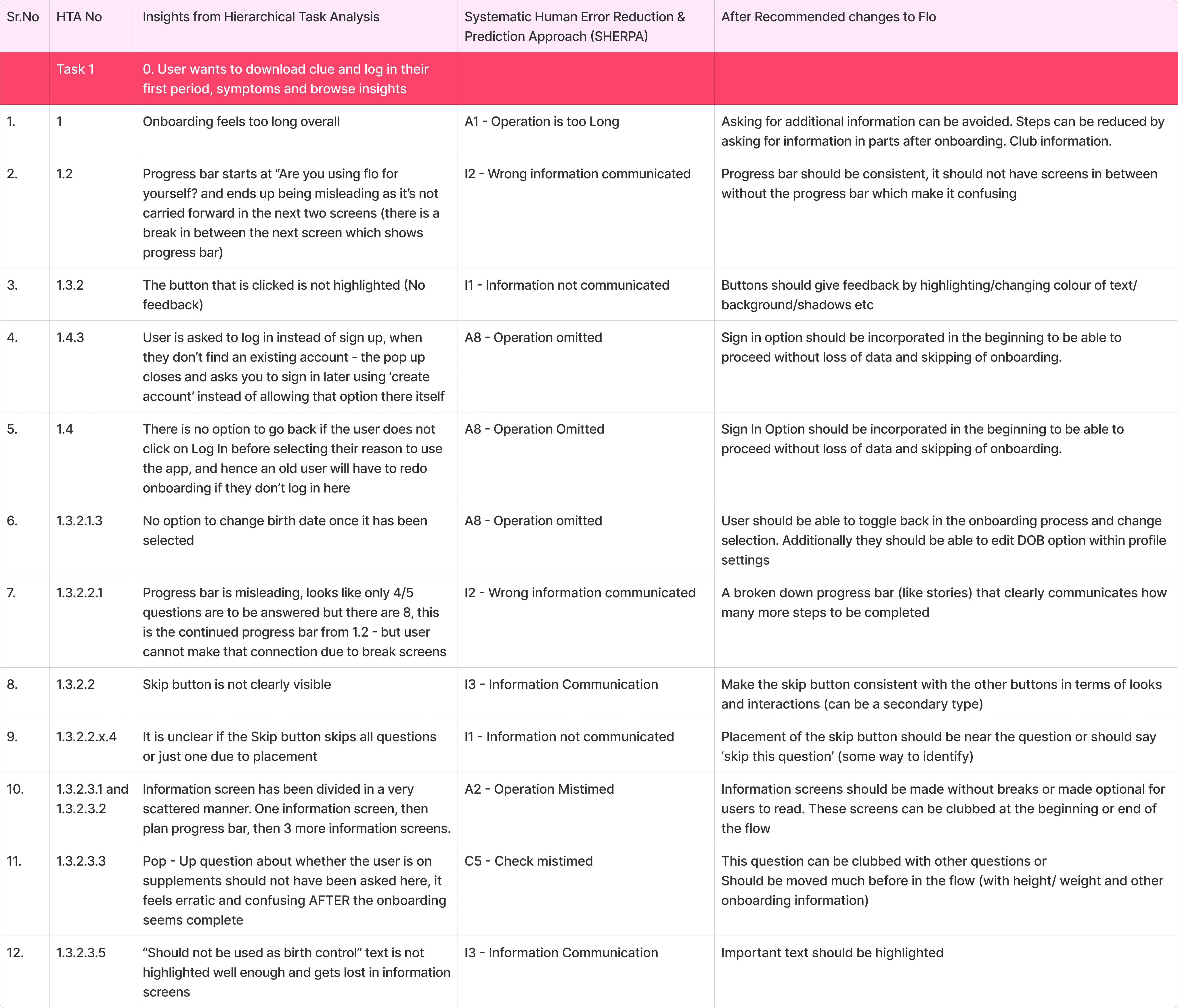
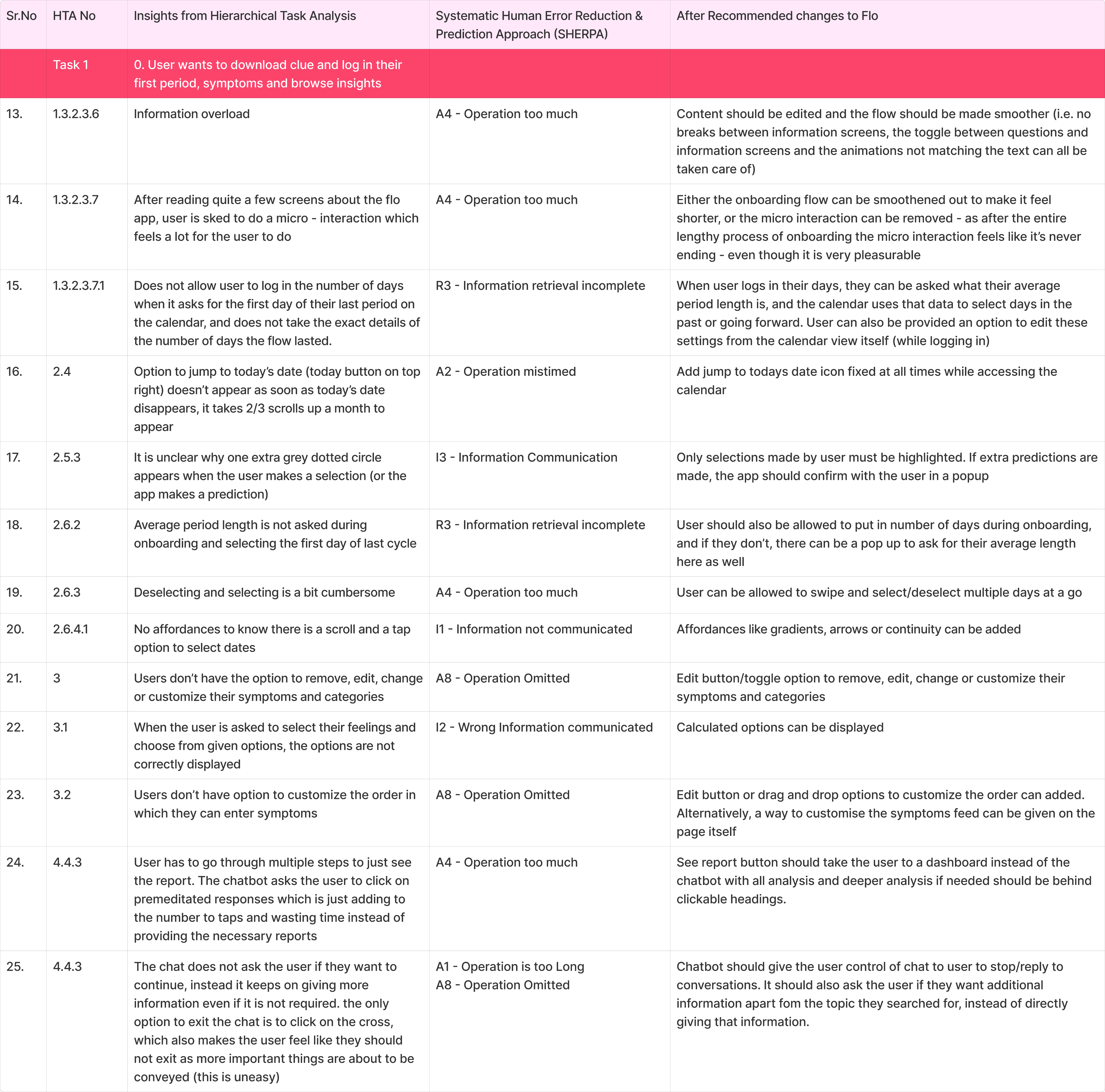
User wants to download clue and log in their first period, symptoms and browse insights
HTA & SHERPA
Task 1:

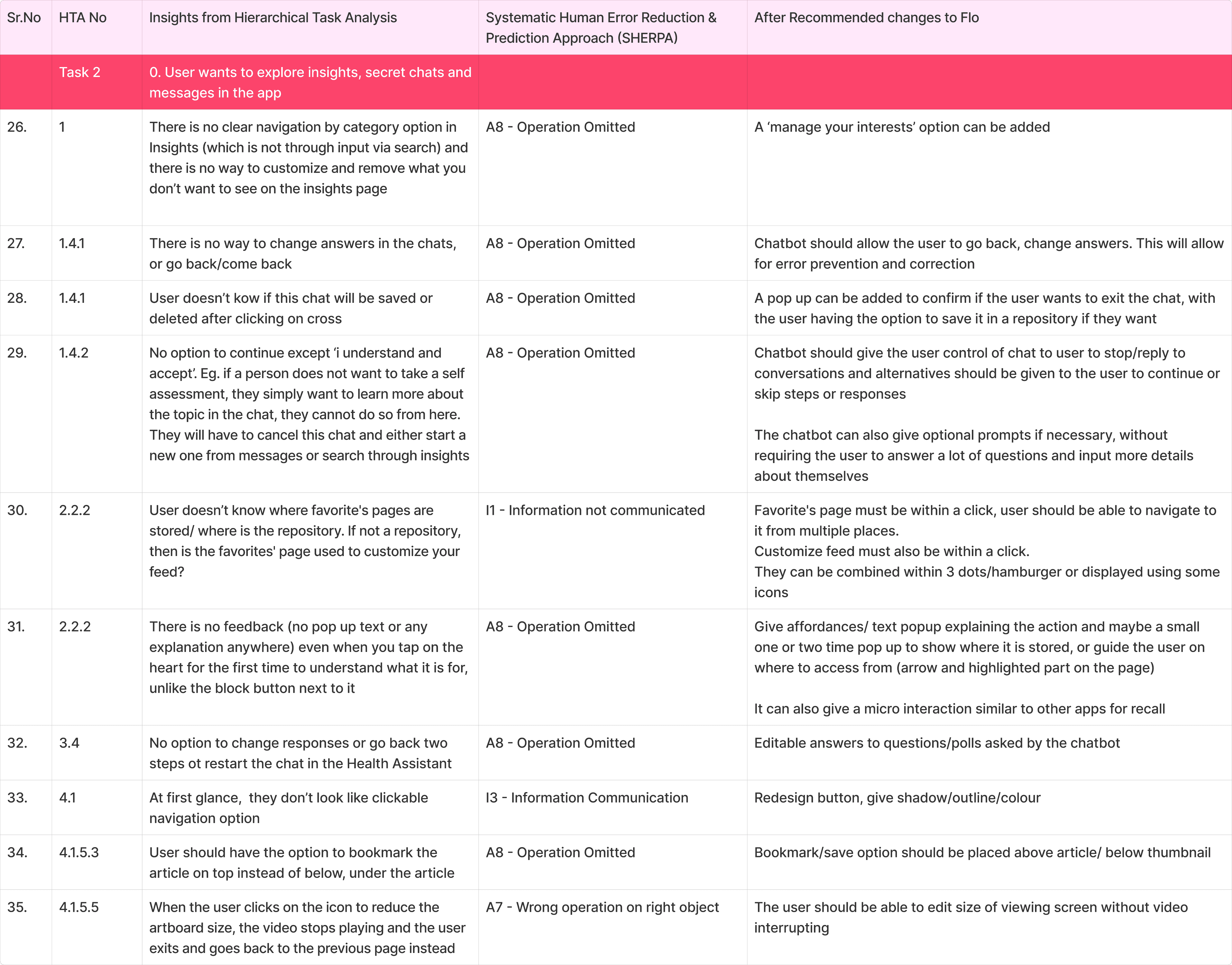
User wants to explore insights, secret chats and messages in the app
Task 2:


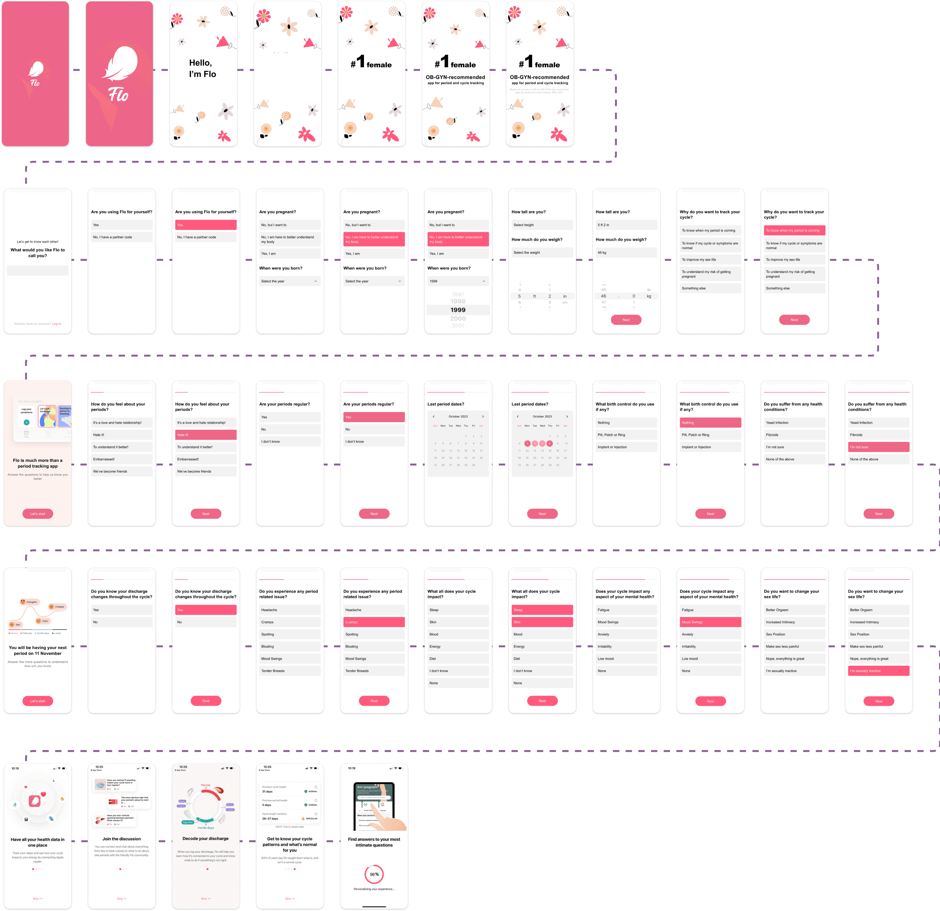


Revised Designs
Redesigned Onboarding
Redesigned Edit Lifecycle Settings
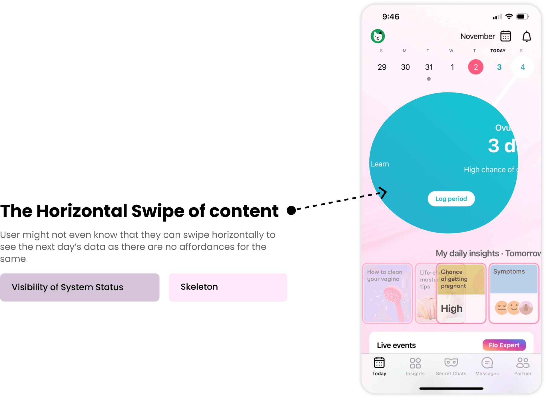
The app is quite useful for the users in understanding about the female body. But there is an overflow of information that becomes overwhelming for users especially when the peak usage is during periods.
The app had multiple navigation routes to the same information and it became repetitive and sometime redundant, but was useful in some cases as well.
The app hid many of the customization options and pushed unwanted information through messages, due to which some of the intimacy of the app got lost
There are many minute details like an edit option or selection feedback problems that adds up to reducing the overall subjective satisfaction of the app
Key Takeaways
Thanks for Scrolling
Khushboo Kumari | Ankita Thakur | Evana Sajan | Nitya Vyas
Design Evaluation
2023 | 2 Weeks
User Research | Usability Testing | UI Design